Swapno
Improving User Experience for Bangladesh’s Largest Grocery Retailer
Jun 27, 2023 - 11 min read
OVERVIEW
Improving User Experience for Swapno — Bangladesh’s Largest Grocery Retailer
About
Shwapno is the largest retail chain in Bangladesh, operating since 2008 with a network of 507 outlets, including 82 company-owned and 425 franchise stores. The brand provides customers with fresh produce, local and imported household essentials, fashion, home accessories, appliances, and more.
This case study details the redesign of the Shwapno mobile app, a leading retail chain in Bangladesh. The goal was to improve the user experience through a heuristic evaluation-based redesign, focusing on key UI/UX principles.
My Role
UX Generalist (Research, Information Architecture, Interaction & Visual Design)
Timeline & Status
6 Weeks, January 2025
Disclaimer
This is a self-initiated project and is not affiliated with Shwapno in any professional capacity. The insights and design decisions presented in this case study are entirely my own, based on a heuristic analysis of Shwapno’s platform.
HIGHLIGHTS
Shwapno aims to create a warm and hassle-free shopping experience both in-store and online.
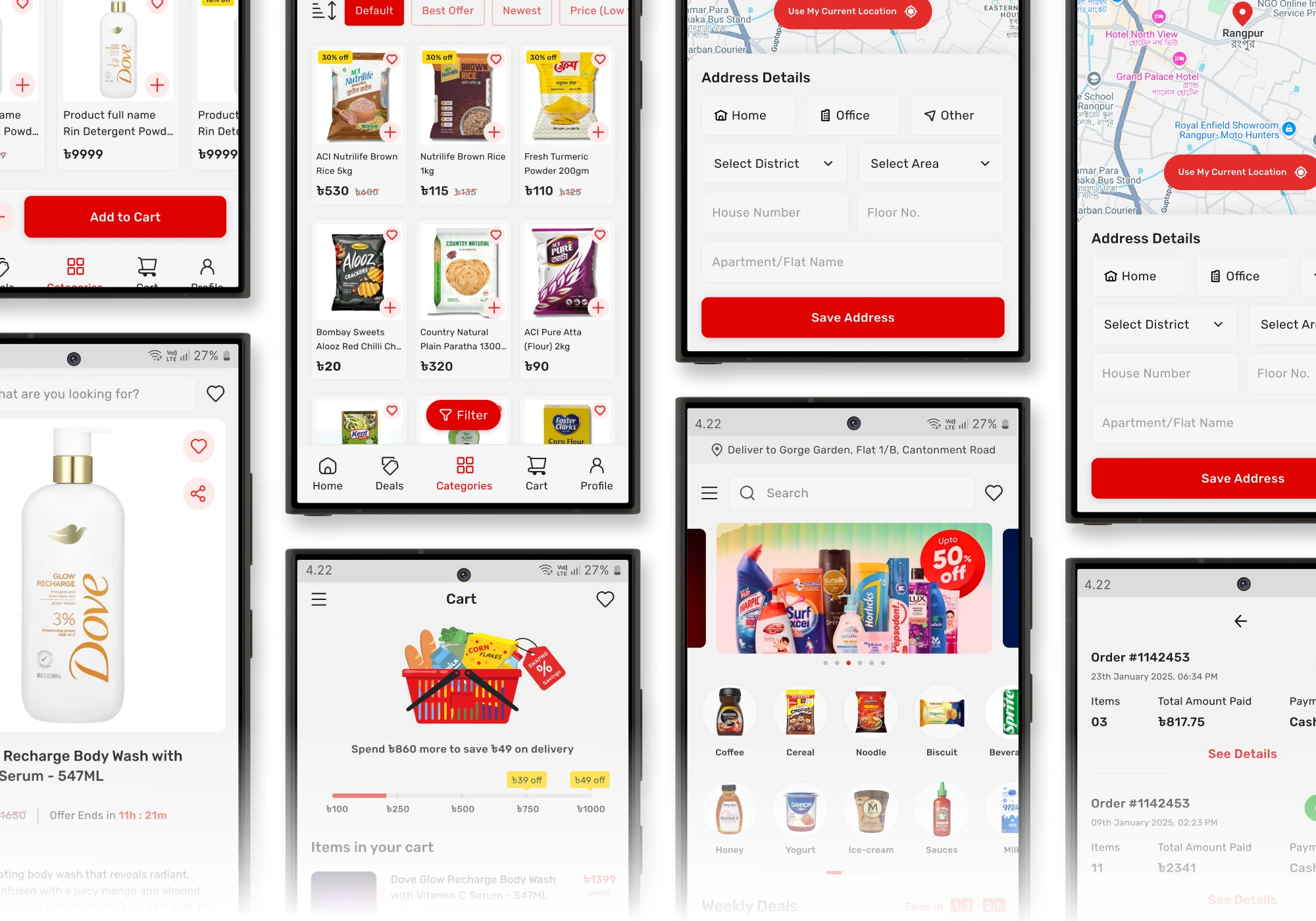
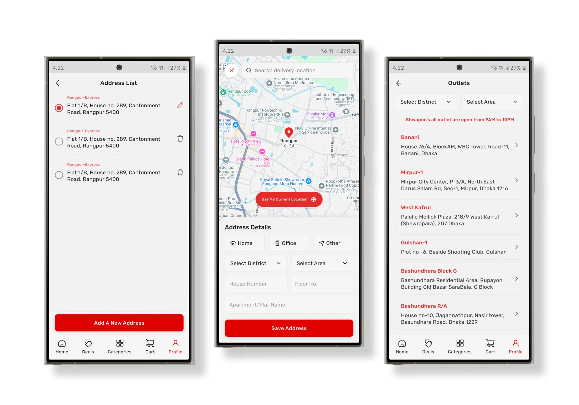
0.1 — Address, Location, Outlets
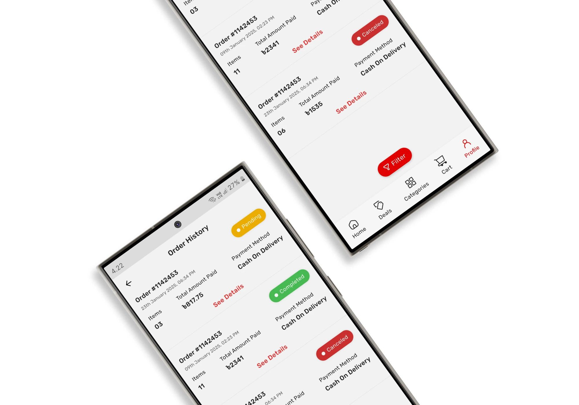
0.1 —Order History
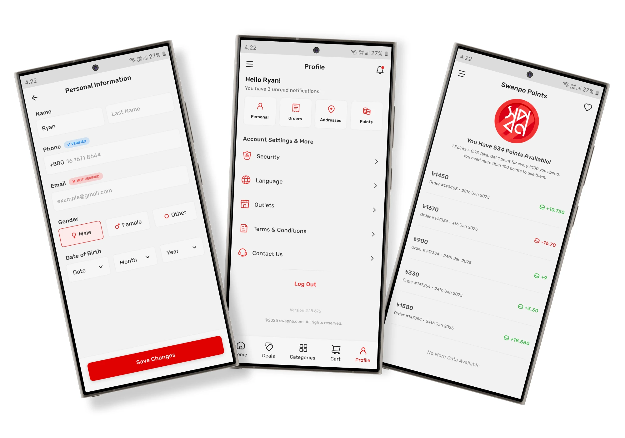
0.2 — Personal Info, Profile, Points
0.3 — Categories, Product Groups
Why Swapno
Why I chose Swapno?
What I've Found
Key Findings from Research and App Analysis
During my research and analysis of the Shwapno app, I identified several areas that could be improved to enhance the overall user experience. My approach was based on core UI/UX design principles, user flow analysis, and a review of common pain points experienced during regular use.
Cluttered Interfaces
Several pages contained unnecessary elements or redundant information that made the interface feel overcrowded. This hindered users from focusing on key tasks and made it harder to navigate the app efficiently.
Poor Navigation
Key features were either hard to locate or placed in areas that didn’t follow logical organization. This wasn’t very clear, as users struggled to understand where to find or access certain functions.
Inefficient Flows
Some flows led to unnecessary steps or confusion in completing key actions. This created friction in the experience, as users faced difficulties performing basic tasks like adding items to the cart or selecting the payment method.
Milestones
Project Goals & Objectives
Establish clear visual hierarchies for essential elements (product cards, navigation) to reduce cognitive load.
Simplify the app’s layout by removing unnecessary elements and introducing a clear side menu or better navigation structure.
Introduce personalized features (wishlist, recommendations) to increase user engagement and loyalty.
Implement intuitive navigation and enhance in-app guidance for seamless product discovery.
Improve the overall visual design to ensure consistency and a modern feel.
Design Approach
Things I have done in order to redesign the app
Identified usability issues based on established UI/UX principles.
Analyzed popular e-commerce (e.g., Chaldal, Daraz, and Pickaboo) to understand their navigation patterns, visual hierarchy, and checkout flows.
Created low-fidelity wireframes to explore layout and flow options.
Developed high-fidelity mockups with a focus on visual clarity and consistency.
Changes
Here’s a breakdown of the key changes I made
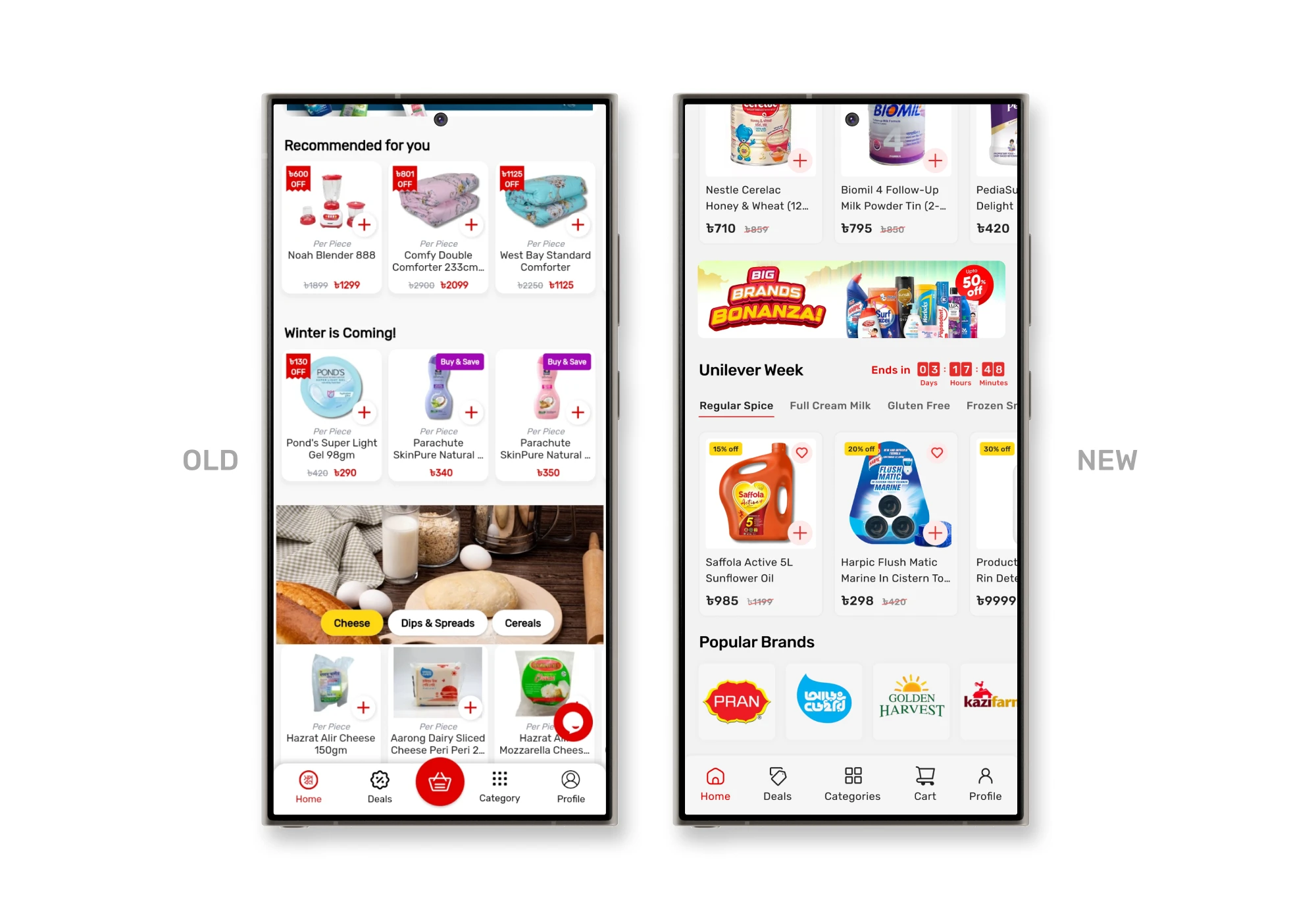
0.1 — Home Page
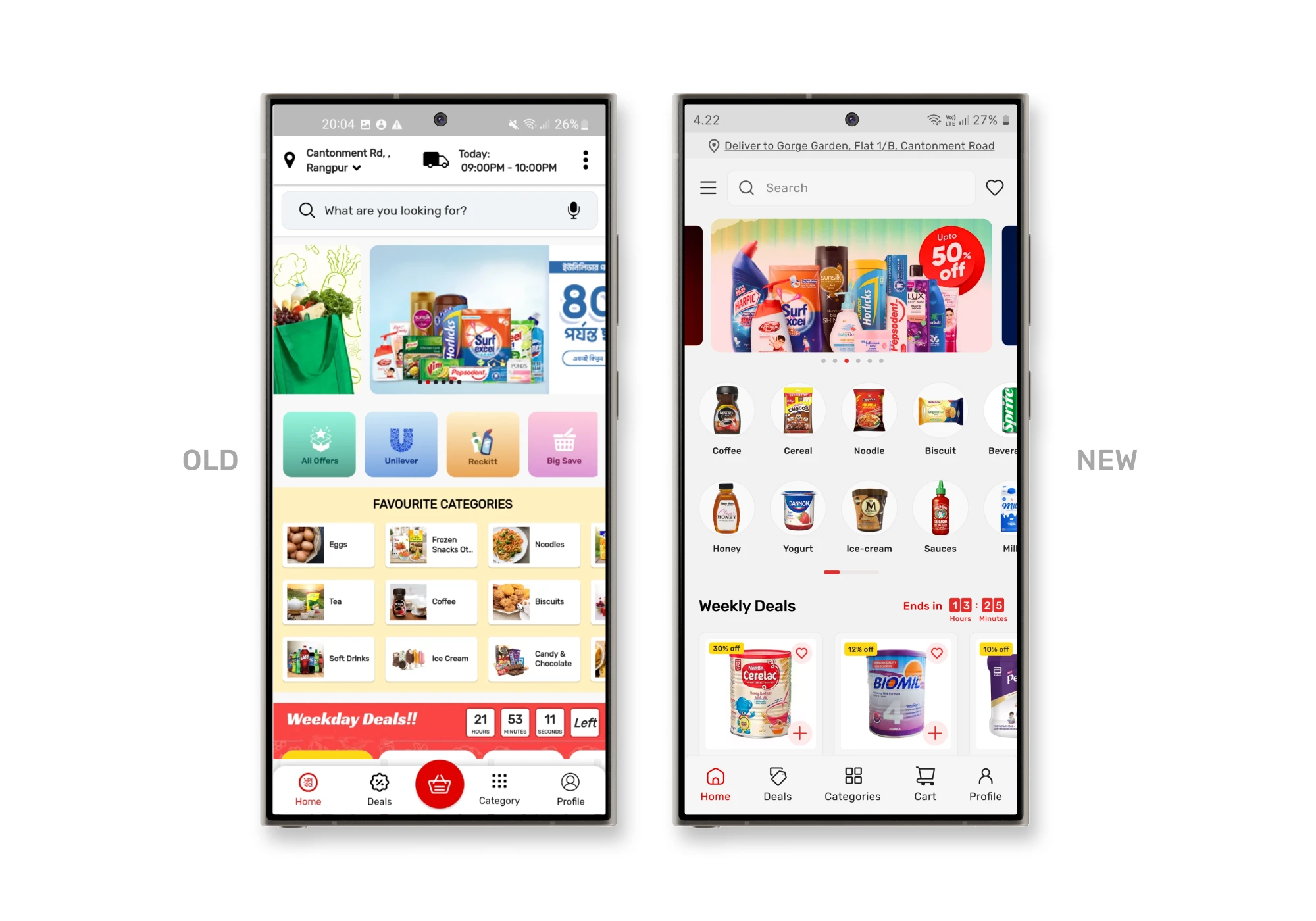
0.2 — Home Page
Problems
In the original design, the top bar had a changeable delivery location and a delivery time, showing the day’s delivery slot. However, since Swapno offers hourly deliveries and this option wasn’t relevant for users who don’t schedule their deliveries.
The banner ad section featured an image slider with pagination indicators placed inside the slider, making it hard to see if there are more offers.
The brand Filtering section was confusing. It had an “All Offers” option alongside “Brand Names,” but it wasn’t clear what its purpose was. Given that Swapno already had a dedicated deals and offers page, and that product filtering typically happens within categories, this section felt out of place.
The favorite categories lacked proper spacing; they had extra white spaces because of the horizontal alignment of text and images. It made them look inconsistent — neither fully like buttons nor icons.
The product cards lacked an “Add to Wishlist” button. Users had to open each product page to add items to their wishlist, which was time-consuming and disrupted the shopping flow. Additionally, the typography was bad, affecting visual harmony.
Solutions
To improve the top bar, I removed the delivery time and repositioned the delivery location below the search bar. I placed the search bar at the top since it’s a key feature for quick access. The wishlist button, which was missing from the home screen, was added to the top-right corner, while the menu was moved to the top-left corner for better navigation.
Moved the pagination below the slider for better clarity. Additionally, I decreased the main slider’s width to display partial views of adjacent slides, subtly indicating to users that more offers are available, encouraging them to engage with the banners.
I redefined the filter options as a brand filter and repositioned it at the bottom of the page, making the layout cleaner and more intuitive.
To address the issue with category icons, I removed the background color and changed the layout from horizontal to vertical alignment. This made the icons more recognizable and visually cohesive. I also left-aligned the section title to enhance readability and support natural scanning patterns.
I added a wishlist button directly on the product cards, allowing users to save items with a single tap. I also left-aligned all text within the cards to improve consistency and make product details easier to scan.
0.1 — Deals Page
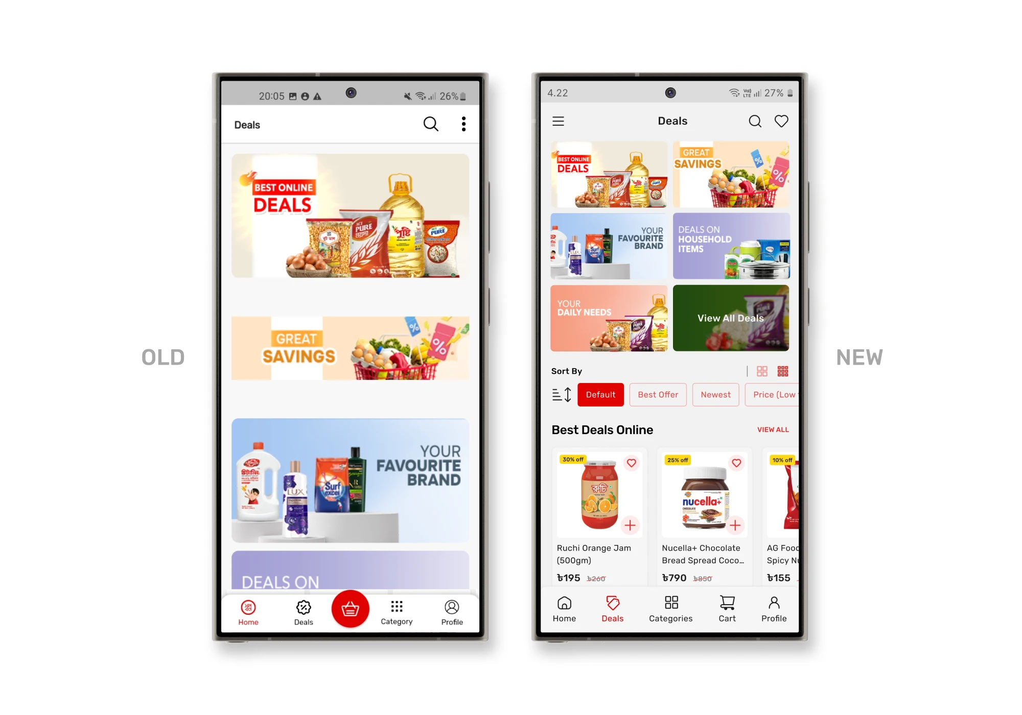
Problems
Solutions
I made the deal cards smaller, allowing more deals to be visible on the screen simultaneously. I also added individual sections for specific deals, giving each offer its own space without overwhelming the user. I also introduced sorting filters—users can now sort deals based on preferences and, find best deals quickly.
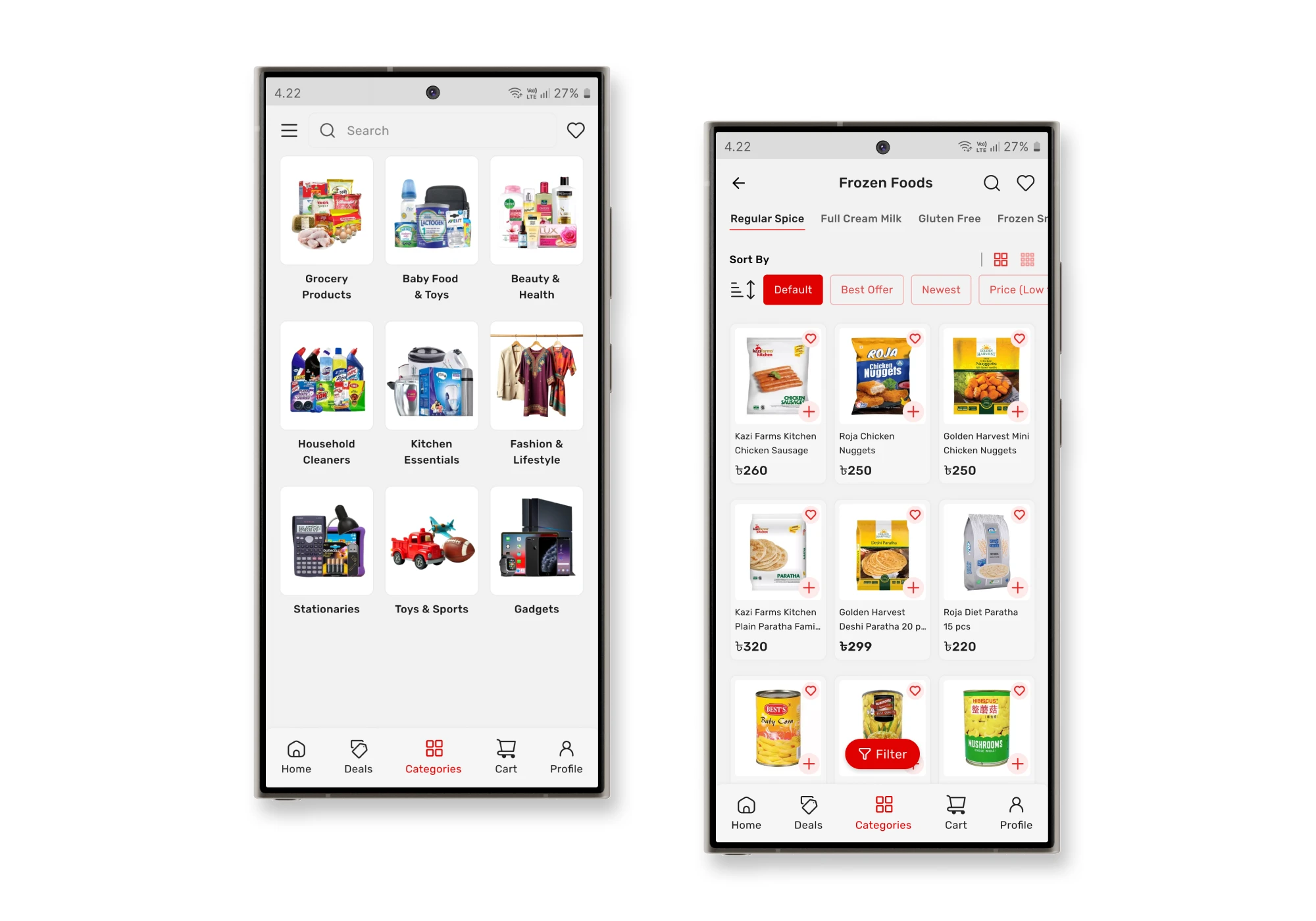
0.1 — Sub-categories Page
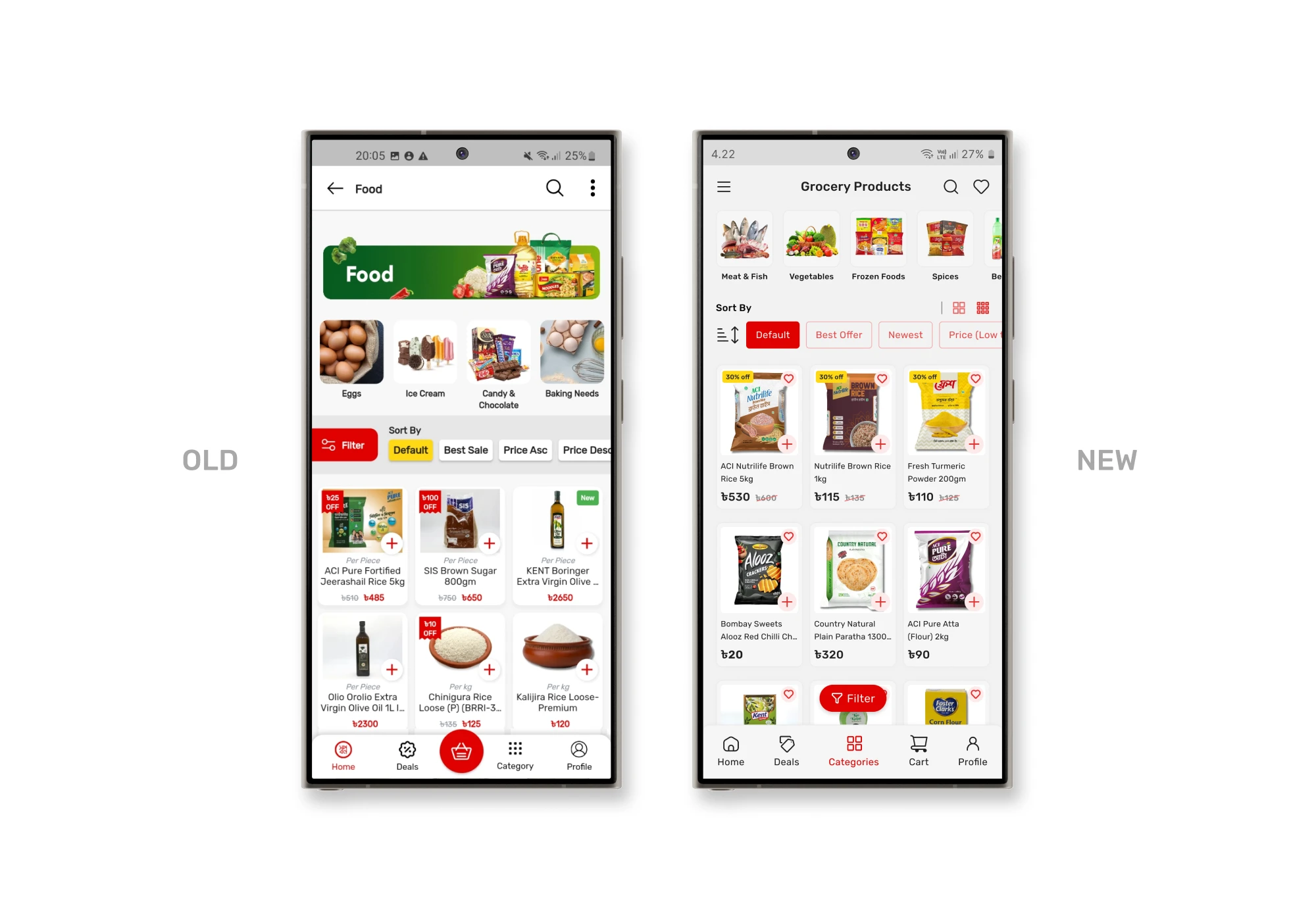
Problems
It had a large banner placed at the top showing the current page title, which was unnecessary since the page title already clearly indicated the category. This added visual clutter without providing any additional value.
Additionally, the filter and sorting buttons were placed side by side without proper spacing, making them hard to distinguish and reducing their overall visibility.
Another problem was the display of products in a three-card-per-row layout, which made it difficult for some users to read product names and details, especially on smaller screens.
Solutions
To solve this, I removed the large banner, creating a cleaner, more focused layout. I repositioned the filter button to the bottom of the screen, separating it from the sorting option, which enhanced its visibility and accessibility.
Additionally, I introduced a button that allows users to switch between large and small icon views. This provides flexibility, enabling users to choose a layout that best fits their preferences.
0.1 — Product Page
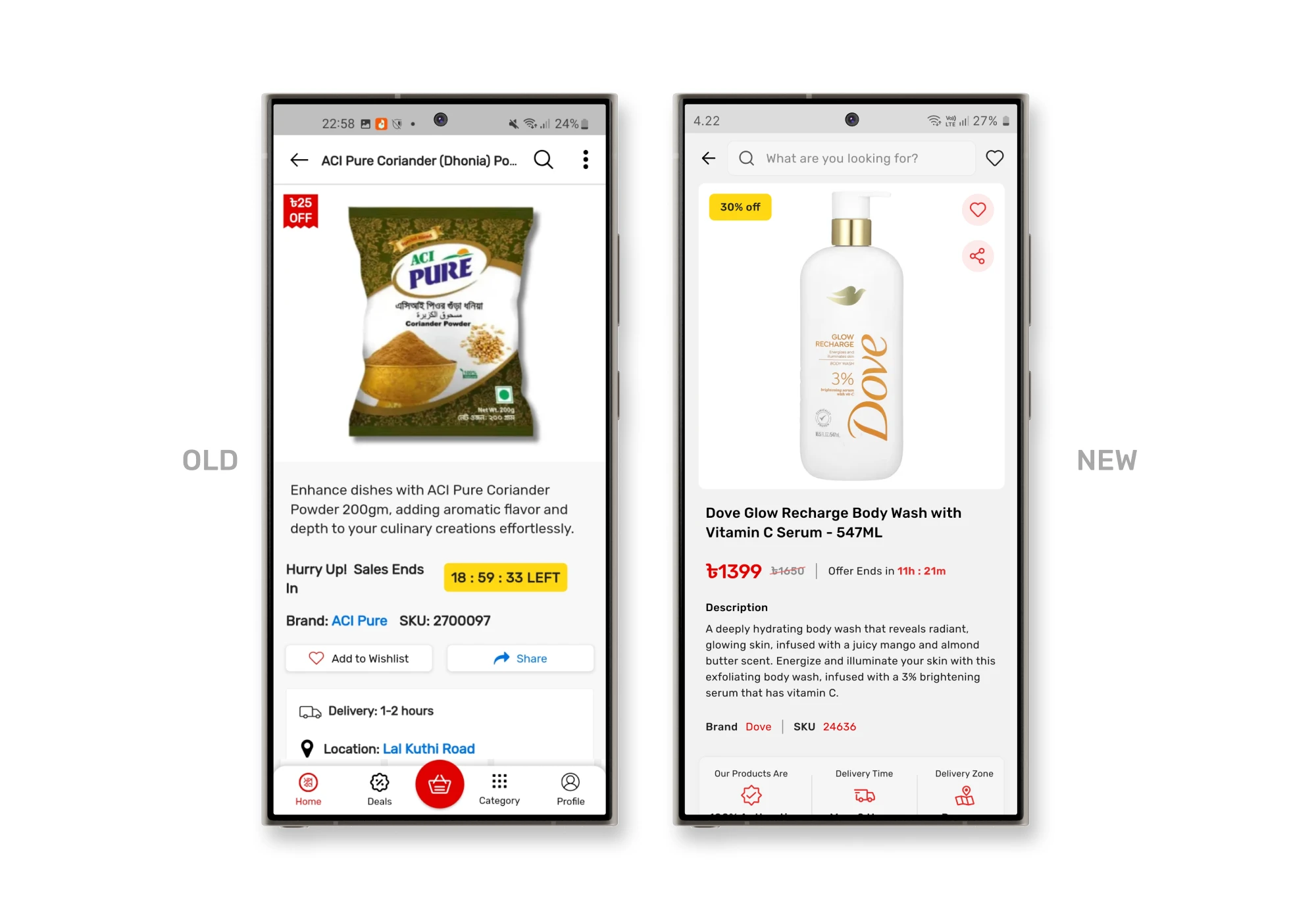
0.2 — Product Page
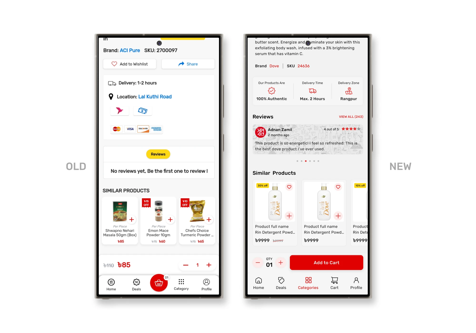
Problems
The product page was one of the most problematic sections in the app. The layout was cluttered, with information scattered in an unorganized manner, making it overwhelming for users to find what they needed. Important features like the add to wishlist and share buttons were hard to notice, buried within the page without clear visual cues.
Additionally, displaying the delivery location has no reason to be on the product page. The payment options were also poorly presented, making them difficult to understand at a glance.
There were reviews section, but no reviews in the page, which diminished user trust. The add to cart button would change into a quantity selector once clicked, creating confusion about whether the item had been successfully added to the cart. Overall, the page lacked a clear hierarchy, making it hard for users to focus on key information or take decisive action.
Solutions
To address these issues, I organized the content to establish a logical flow of information. The wishlist and share buttons were repositioned to the top right corner within the main product image, making them easily accessible. I refined the delivery and payment information, focusing on details that enhance user confidence during the purchase process. For the reviews section, I designed a dedicated area with food-themed vectors, inspired by Swapno’s branding style, to create a friendly and authentic feel.
Additionally, I introduced a clear “Add to Cart” button as a fixed call-to-action (CTA), eliminating any confusion. This streamlined approach provides users with a more intuitive, organized, and trustworthy shopping experience.
0.1 — Cart Page
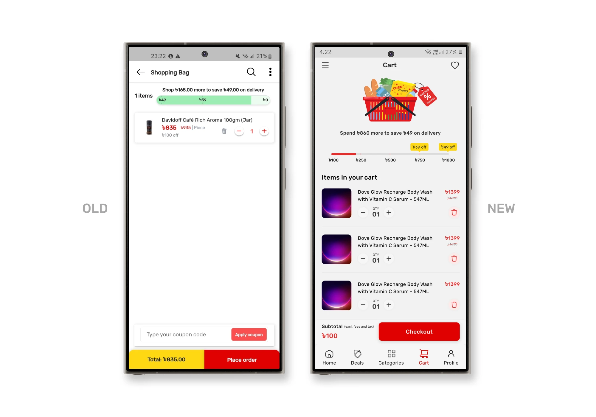
Problems
The discount offer for users spending over a certain amount was displayed unclearly, making it difficult for users to understand the benefit. It says shop 165TK more to save 49TK, but the progress bar shows a different thing.
Additionally, the delete button on item cards was hard to click. Lastly, the coupon input field was misplaced, making the page feel disorganized and overwhelming.
Solutions
I restructured the discount section, adding a clear vector and message that explains how much users can save upon reaching a certain spending threshold. I also introduced a progress bar showing users how much more they need to purchase to unlock the discount, providing a more intuitive and motivating experience.
I rearranged the item card layout to separate the add/remove and delete buttons, ensuring the delete action was more accessible without cluttering the card with excessive information. Additionally, I removed the unnecessary text and coupon input field from this page, ensuring a cleaner, more intuitive flow.
0.1 — Checkout Page
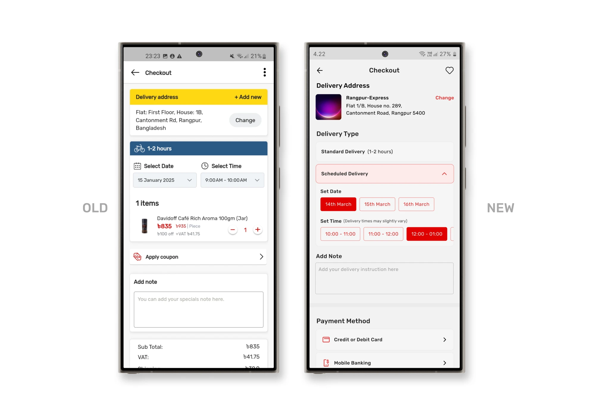
0.2 — Checkout Page
Problems
The checkout page had several usability issues that could lead to frustration and potential drop-offs. Firstly, the button to add a new address and change the current address was placed together, making it redundant. Since users can already change their delivery address, they don’t need the “add new address” button here. This extra option created confusion and clutter.
Additionally, the delivery date and time selection posed a significant problem — if a user needed immediate delivery but accidentally chose the wrong time slot, it could result in delayed deliveries.
Another issue was the redundant display of cart items alongside their delivery times. Users had already reviewed these items in the cart, making this repetition unnecessary and adding cognitive load.
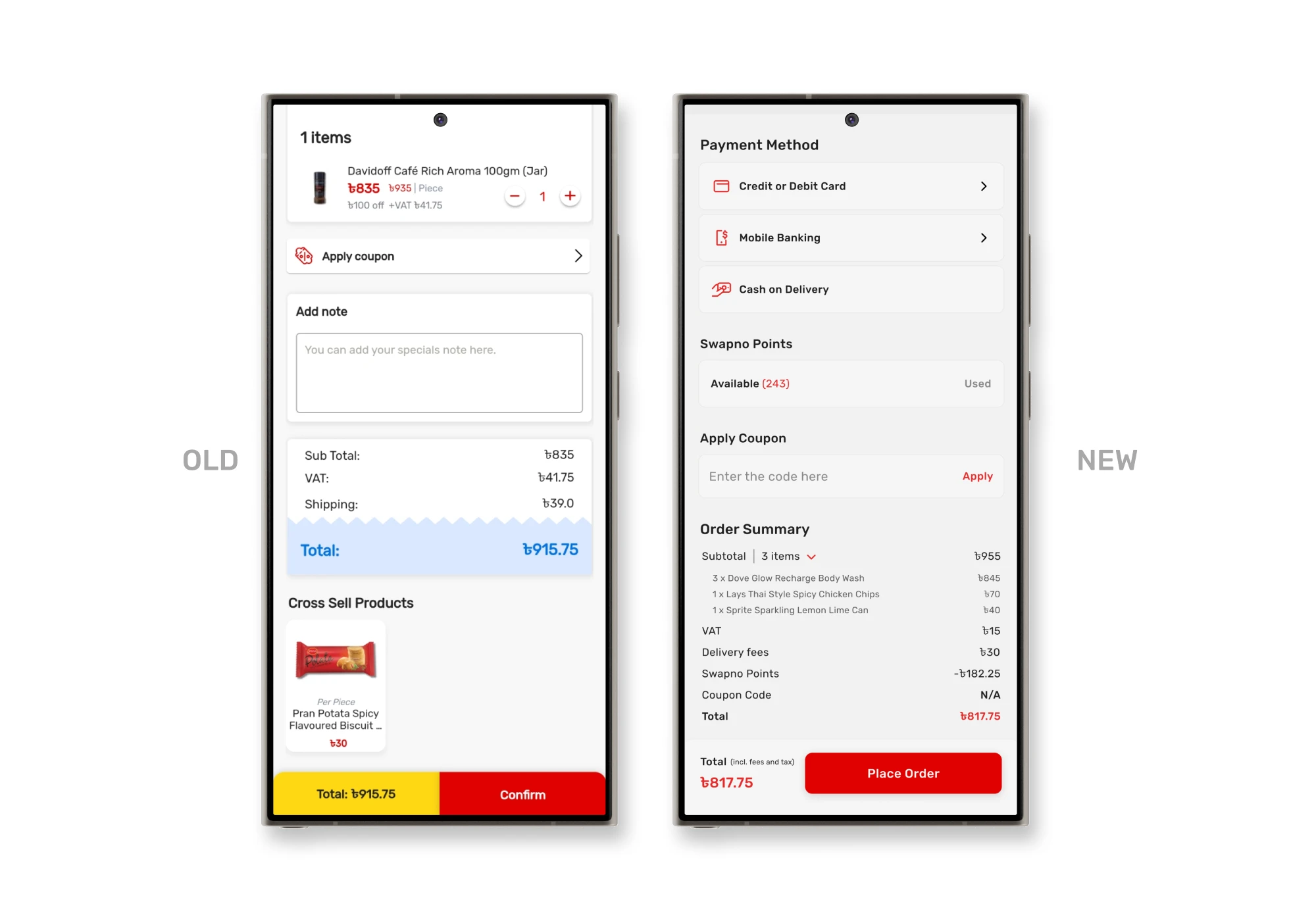
Critically, the absence of a payment method selection was a major flaw, as users had no way to choose or modify how they wanted to pay.
Lastly, Swapno’s loyalty points system was limited to walk-in members, and app users couldn’t view or utilize their points, forcing them to visit physical outlets — a poor experience in a digital-first environment.
Solutions
To fix it, I removed the add new address button and kept only the change address option, offering a clear call-to-action (CTA) for any address modifications.
Introduced a new feature called delivery type, allowing users to choose between standard delivery and scheduled delivery, reducing the risk of mistakes.
Additionally, I added a delivery notes section right below, enabling users to provide special instructions without having to scroll through the entire page.
I addressed the payment method issue by incorporating a dedicated payment method section, giving users full control over their payment preferences.
For loyalty points, I added an option for users to apply their points directly during checkout.
To streamline the process, I added an order summary section where users can easily review the total amount, discounts, and charges. If they wish to see the list of items, it’s neatly hidden within a collapsible summary, reducing clutter.
0.1 — Order Details Page
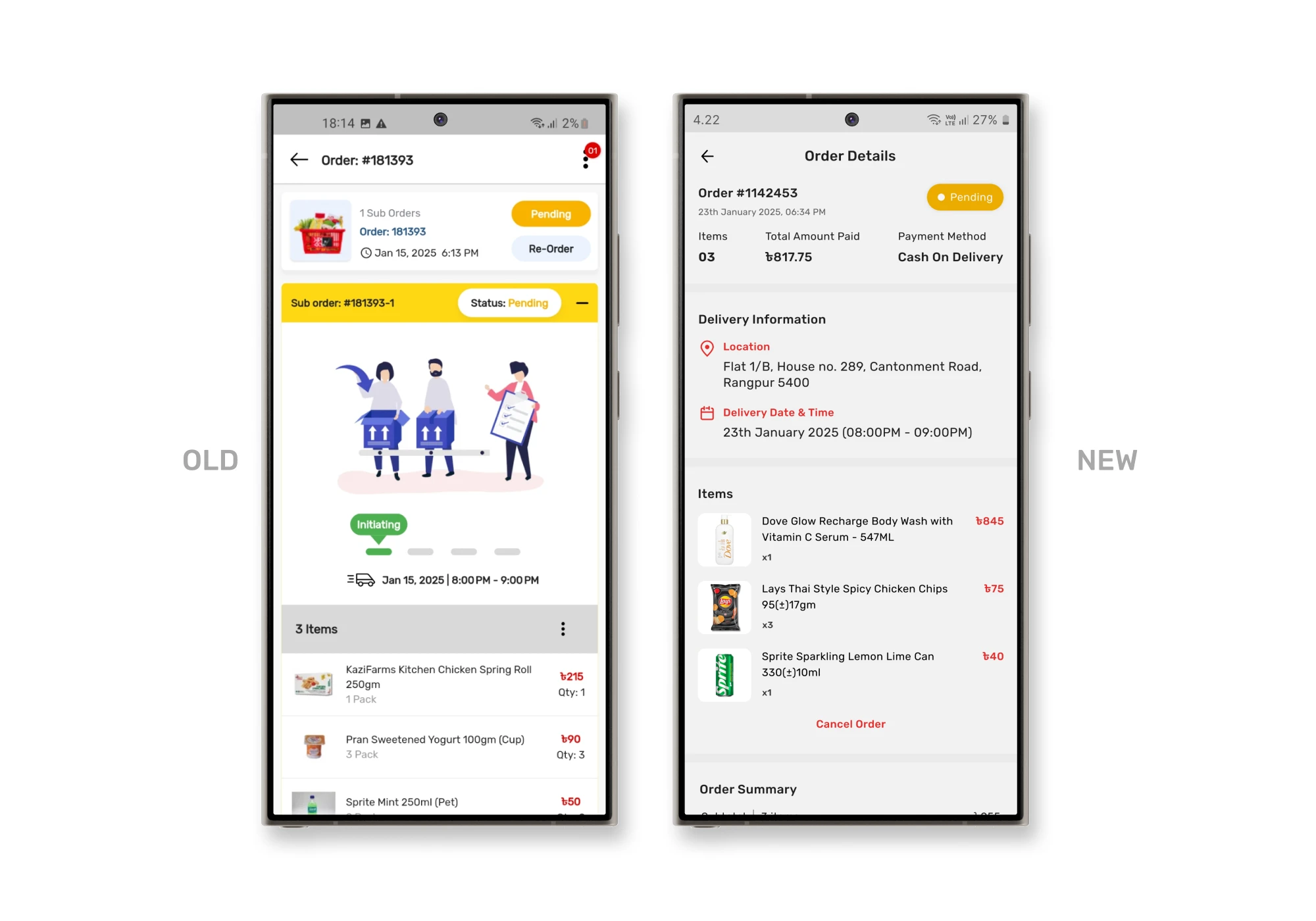
0.2 — Order Details Page
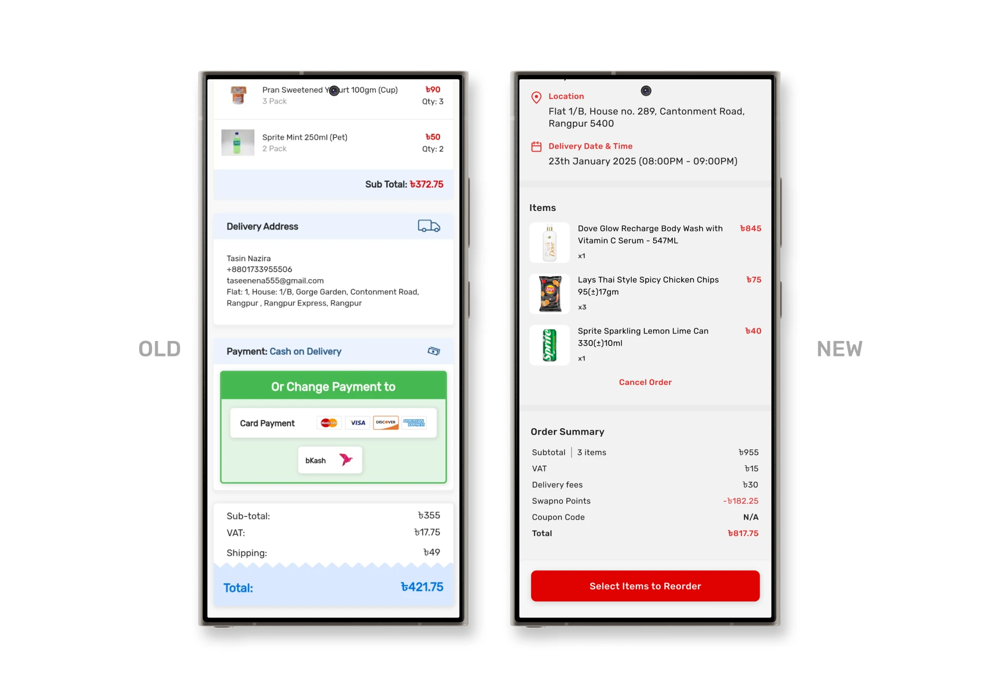
Problems
The re-order button was positioned at the top, users are unlikely to reorder without reviewing the items in the cart first.
A large vector image occupied a significant portion of the page, which was displaying order status but showing the same info twice cluttered the layout and distracted from the important information.
The order cancellation button was hidden in a 3-dot menu, making it hard for users to find, even though it was an essential feature. It might be done for business purposes, but they haven’t done this in the right way.
Solutions
I repositioned the order cancellation button below the items list, ensuring that users could easily see the items first and then make decisions like cancelling the order. I also removed the background from the cancellation button to make it less prominent, reducing the visual clutter and guiding users toward more critical actions.
Additionally, I reorganized the page to display information in an order that users usually need to see first. This helped users immediately see key details like delivery address, payment method, items, etc. leading to a more intuitive and efficient browsing experience.
0.8 — Notification Page
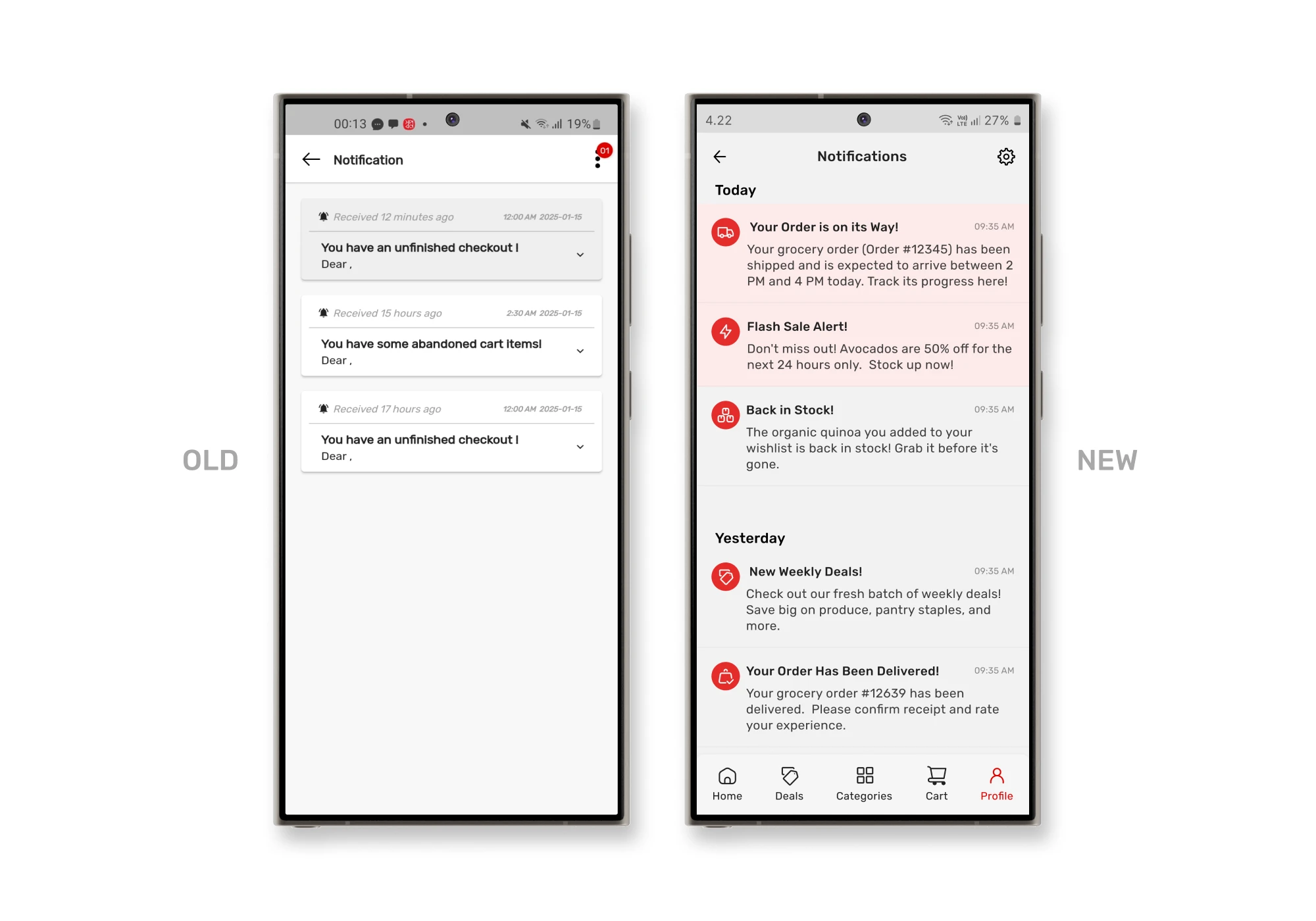
Problems
The notifications section had a significant usability issue. It displayed only the title of the notification, which required users to click on each notification to view its content. This extra step made it frustrating for users.
Solutions
I expanded the notifications to show both the title and the description directly on the notifications card. This allowed users to quickly scan the content without needing to click each notification. Additionally, I added icons to help users easily understand the type of notification they received at a glance, making the feature more intuitive and efficient.
0.9 — User Page
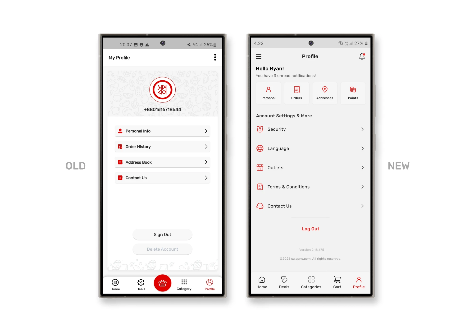
Problems
The profile icon at the top displayed a number instead of the user’s name, which could be confusing since users usually expect to see their name for personalization.
Solutions
I displayed the user’s name as the primary element, making it more intuitive. Below the name, I organized the personal information, orders, addresses, and points for easy access, followed by other sections like security settings, outlets, and app settings, to clearly separate personal data from app-related options. This restructuring helps users quickly find the information they need while keeping the interface clean and user-friendly.
0.10 — Support Page
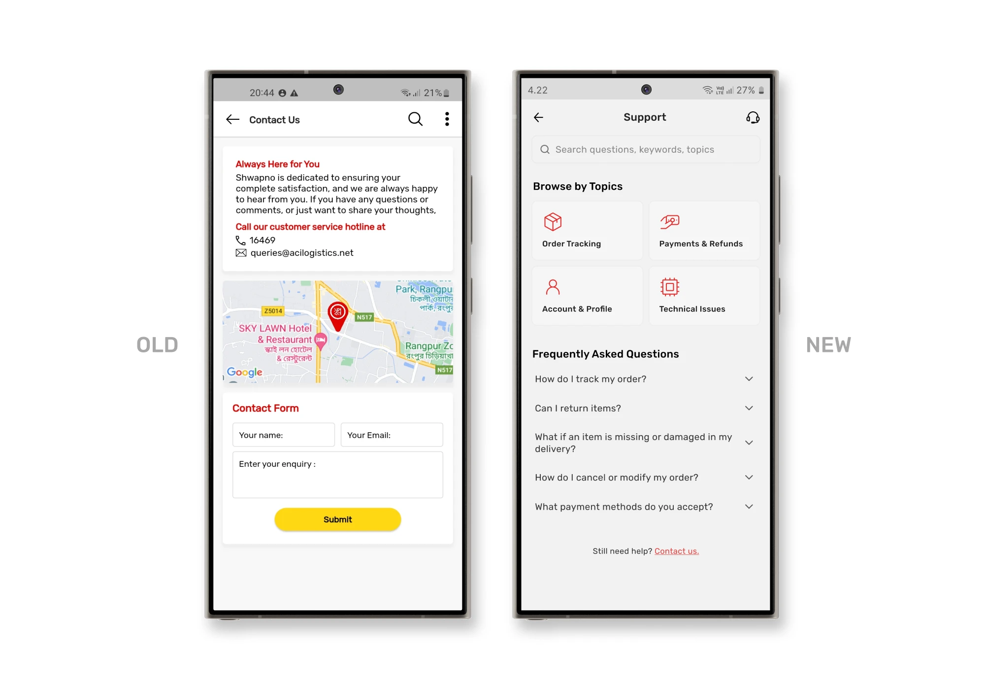
Problems
Swapno’s Contact Us page describes how they are there for users, but the priority should be problem-solving and enabling quick contact. They provided a phone number and an email address as clickable buttons, but the font size was very small, making it hard to notice and click. Additionally, there was a map showing the user’s location, which served no clear purpose, adding unnecessary clutter.
Swapno also had a live chat icon on the homepage, but clicking it only led to a form-filling section, with no self-help options like FAQs. There was no dedicated support page, which made it difficult for users to find the help they needed quickly.
Solutions
To solve this, I combined the live chat and contact us features into a unified Support page, accessible from the user profile. Here, I introduced an FAQ section for self-help, added a search bar to find answers quickly, and organized topics for easy browsing. If users can’t find the answers they need, there’s a “Contact Us” button at the bottom of the page, which leads to a page where they can choose how to get in touch. To subtly encourage self-help, I also included FAQs again on the contact page.
This structure helps users find solutions faster, reducing the need for unnecessary support requests while keeping the experience clean and efficient.
Project Takeaways
Key learnings from the redesign
Selective use of design frameworks
Using only the necessary design frameworks helped tailor solutions to specific issues, making the redesign more focused and flexible.
Keeping it simple
Streamlining the interface by removing redundant elements and organizing content improved overall usability, making it easier for users to focus on key tasks.
Iterative design is key
Regular iterations and feedback loops proved essential for aligning design decisions with user needs, leading to a more intuitive and error-free experience.
Reducing cognitive load
Reorganizing the layout and repositioning elements ensured that key functions were easy to locate, reducing cognitive load and boosting efficiency.
Centralized support efficiency
Combining live chat, contact options, and FAQs into one dedicated support page simplifies access to help, guiding users to self-solve issues before reaching out directly.